Structure Supply Co.
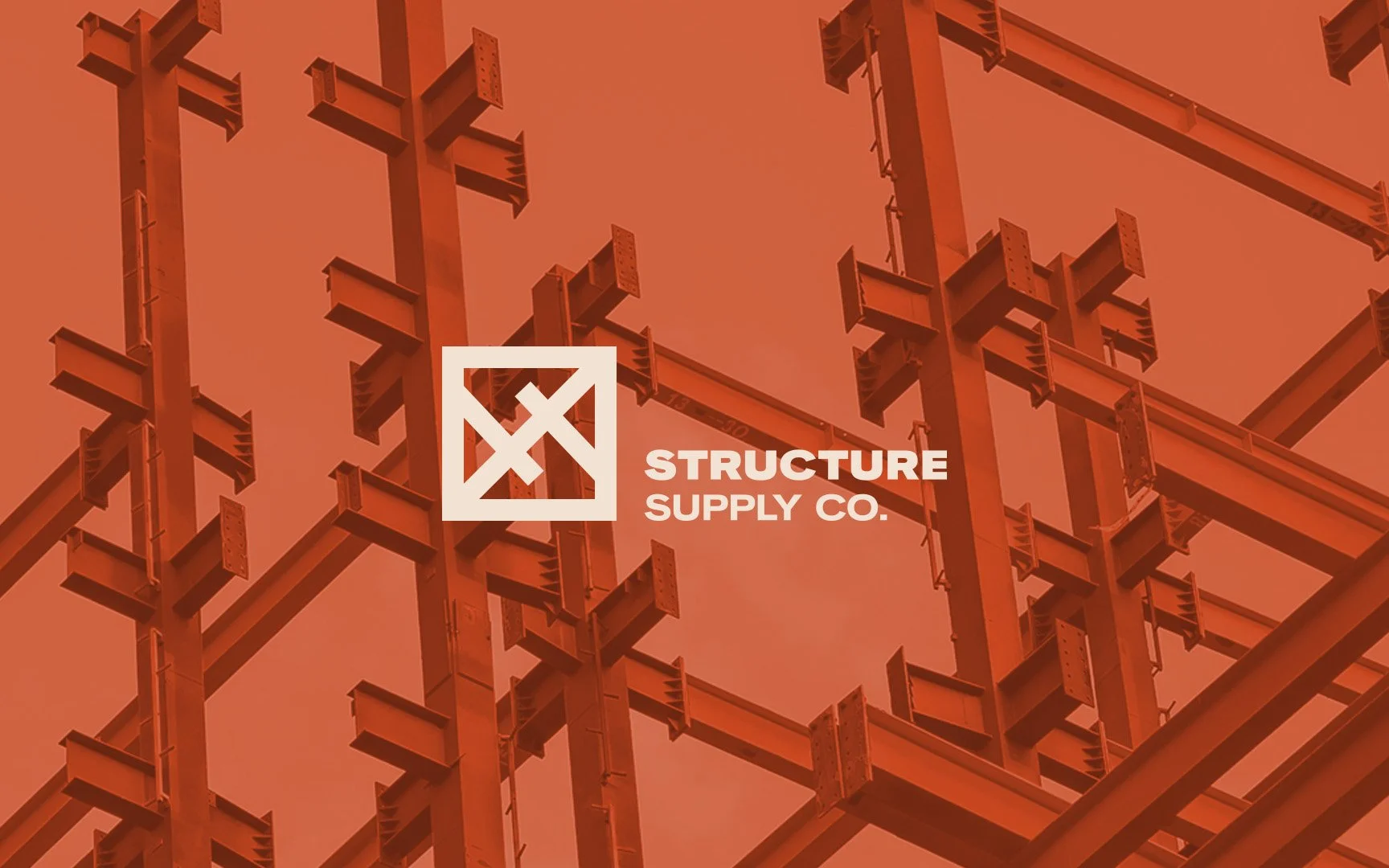
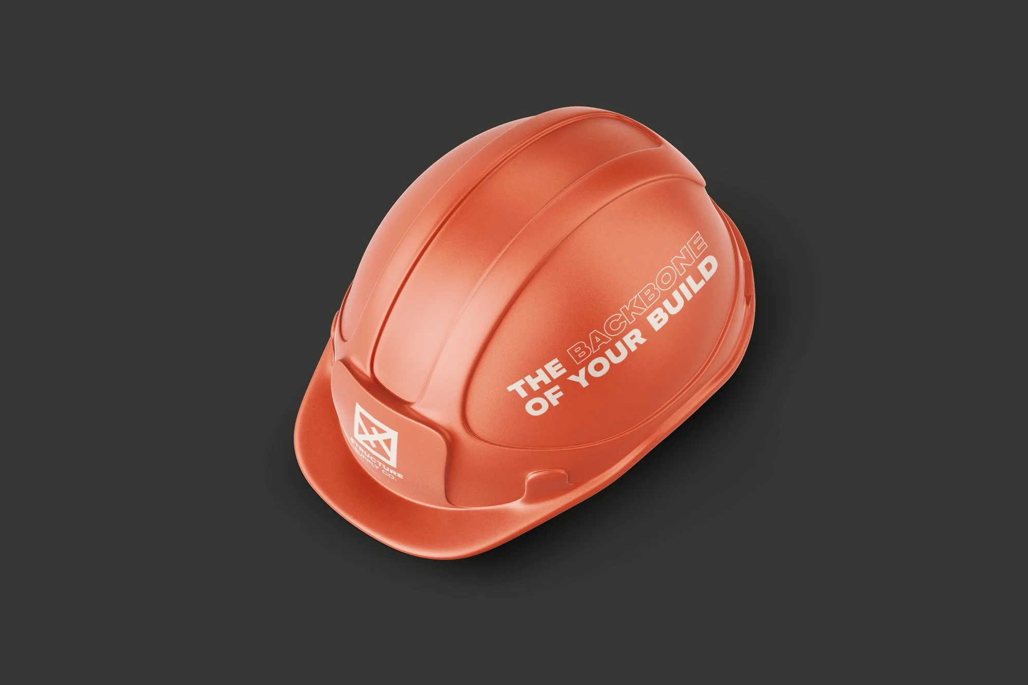
For Structure Supply Co, I developed a brand identity system rooted in strength and support. The logo, featuring an "S" forged from overlapping support beams, symbolises their commitment to quality. The colour palette, earthy tones paired with industrial grey, and the bold sans-serif typography convey reliability and professionalism. This brand identity system was then applied across all touchpoints, from business cards to site banners, creating a cohesive and impactful brand experience.
Client
Structure Supply Co
Project Type
Brand Identity and Style Guide