Colour + Light
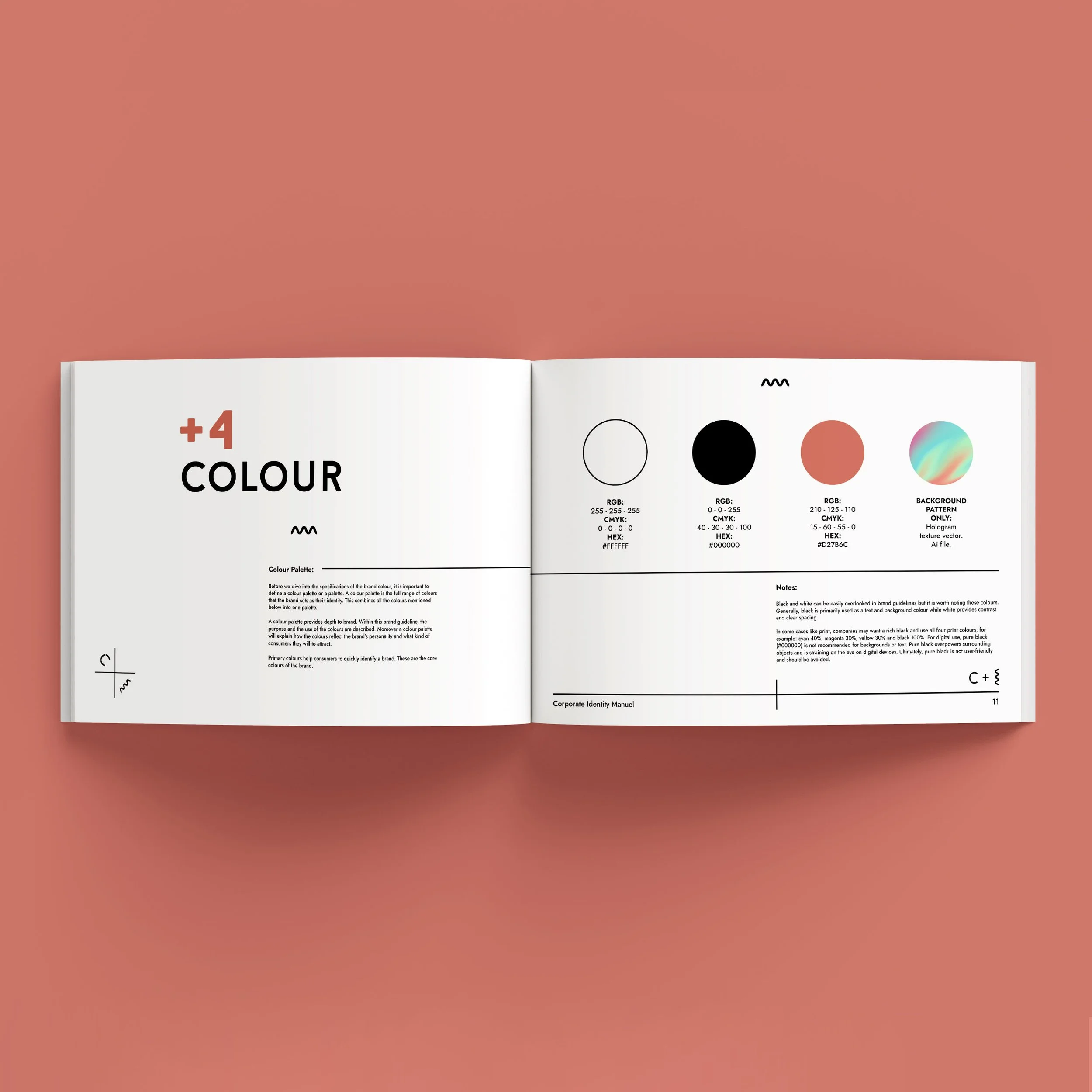
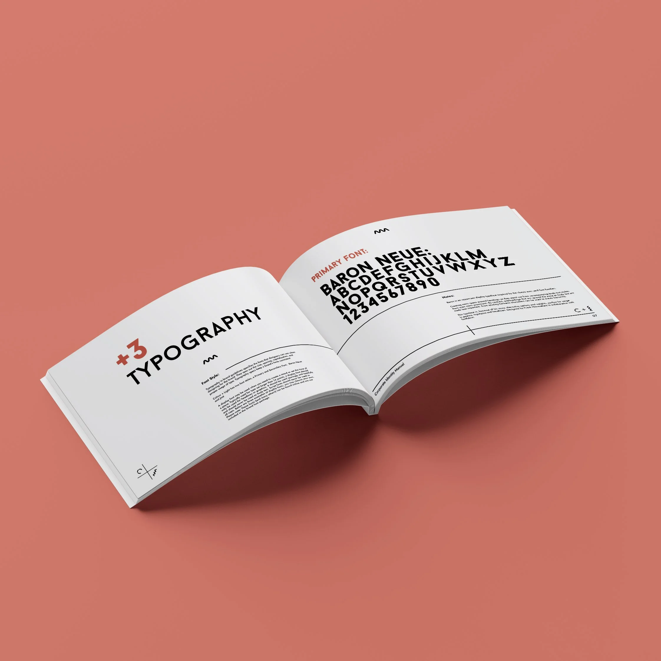
This is the corporate identity and style guide I created for Colour and Light, an LED lighting specialist. Here I have created a monogram logo using the initials "C+L" with the idea being that the "C" represents the colour wheel, the "L" represents the waves that light travels in and the "+" shows the angle that light enters the human eye and flips upside down (like a diagram of a camera lens). The logo works on black or white and I have also added a "hologram" style background to add to the playful nature of the brand as well as the practical representation of coloured light. The brand style guide includes a comprehensive section on brand imagery, with detailed instructions on the desired style and approach to photography. This ensures all photographic assets align with the brand's established visual identity and contribute to a unified and impactful brand presence.
Client
Colour + Light
Project Type
Brand Identity and Style Guide